 Swedish web site

# Lab assignment 3
The aim of this Lab assignment is to help you learn how to work with *responsive
design* for web pages, i.e. applying different layout depending on the size of
the device used to view the web page.
## Learning objectives
- mobile first design
- responsive design
- CSS media queries
- CSS used to hide elements (e.g. when implementing a responsive design), e.g.
`visibility: hidden`, `display: none`
- CSS used to implement the hamburger menu in this assignment, e.g.
- how different selectors work (e.g. descendant, sibling, child)
- which selectors are more/less specific
## Checklist for review session
Your review of your assignment should cover the bullet points below.
- Show your wireframes for your layouts.
- Show your responsive design implementation in a web browser.
- Give a brief overview of how the layout changes between device sizes.
- Explain your overall implementation strategies. Did you use the same strategy
for all device sizes? Why? Why not?
## Deliverable
Upload your wireframes (PDF:s that show columns and content) + a zip-file with the files for your implementation to Lisam. **Please make sure you name your group correctly (i.e. A1, B3 etc) and add both members of the group to the Lisam submission.**
## Requirements for passing the assignment
- wireframes sketches that use a column grid that show your indended layout for the following three device sizes:
- mobile
- tablet
- desktop
- responsive design implementation that switches between the mobile, tablet and desktop layouts from your wireframe sketches
- your layout should not "break" between or outside your breakpoints
- use relative size units in rather absolute size units in your layout CSS, i.e. your layouts should use the *fluid layout* strategy
- present and discuss your wireframes and your implementation during the oral assignment review
*Fluid layout* combined with having different layouts for different device sizes
is at the core of that web developers call "responsive design". More to read
here:
- [What is the difference between fixed, fluid, adaptive and responsive layouts and why should I care?](https://medium.com/@space.alpaca/so-what-exactly-is-the-difference-between-fixed-fluid-adaptive-and-responsive-layouts-and-why-3773272d8481)
- [Fixed vs. Fluid vs. Elastic Layout: What's The Right One For You?](https://www.smashingmagazine.com/2009/06/fixed-vs-fluid-vs-elastic-layout-whats-the-right-one-for-you/)
# Assignment
## Draw column grid wireframes
Create wireframes *that use a column based grid with gutters* to create the
layouts in the image below. Draw your wireframes **before** starting with the
implementation.
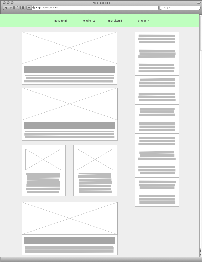
### Content components
In this lab assignment the web page contains three types of content components:
- **featured items**: contain an image, a headline and some text
- **secondary items**: contain an image and some text
- **latest news items**: headline from the latest news
The image below illustrates the content on the page.
### Three device sizes
Draw wireframes that show layouts for the following device sizes:
- mobile phone
- tablet
- desktop computer
Start with the layout for the mobile phone and move upwards in size from there:
1. Decide which content elements need to be available when browsing on a mobile
phone and draw your mobile layout wireframe. The menu should initially be
hidden when using the mobile layout. The hamburger icon however should be
visible. When the user clicks the hamburger icon, the menu should be visible.
*See information below about the hamburger menu*.
2. Decide which content elements need to be available when browsing on a tablet
and draw your tablet layout wireframe. Decide whether the menu is initially
shown (as in the desktop layout) or hidden (as in the mobile layout).
3. Decide which content elements need to be available when browsing on a desktop
computer and draw your desktop layout wireframe.
**Note**: When applying a *mobile first* design approach, selecting the initial
content is a very important step. You will however only be going through the
motions of selecting content in this assignment as we are not working with real
content.
### Creative freedom
You do not have to copy the layout in the illustration below. Feel free to *be
creative* and use a different layout, i.e. create a layout that has the same
content components as the illustration below, but uses a different layout.
You could e.g. place the "sidebar" as a row of cards at the bottom of the page
and have the "main" column take up all the space in the middle. Or the "main"
column could be displayed as two columns.
The "sidebar" could also be moved to the top, to the left, made into two column
etc.
## Implement your layout
- [Download the files for the assignment](lab3_files_vt24.zip)
- Implement the layout using mediaqueries and a single CSS-file
- **You need to `meta` tag with viewport information to the HTML file in order to get your
mobile layout to work**. See [viewport meta tag](https://developer.mozilla.org/en-US/docs/Mozilla/Mobile/Viewport_meta_tag).
### About the hamburger menu
The `lab3_contents.html` file contains a menu:
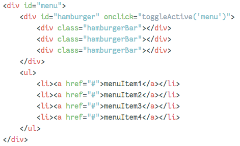
When the hamburger icon is clicked the JavaScript in the HTML file adds the
class `active` to the `div` with `id="menu"`. CSS rules in
`hamburger.css` then change the shape of the hamburger icon into a cross. These
rules are only triggered when the `div` with `id="menu"` also has
`class="active"`. E.g.
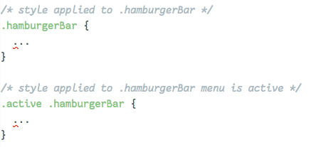
The selector `.active .hamburgerBar` is more specific then just
`.hamburgerBar` and the more specific a selector is, the more important it is.
The first selector says "only apply this to any element with the class
`hamburgerBar`". The second selector says "only apply this to the elements that
have the class `hamburgerBar` and are descendents to elements with the class
`active`
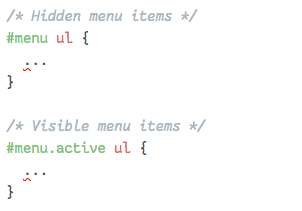
You can use the the same trick to show or hide the `ul` element that contains
the menu:
Page responsible: Robin Keskisärkkä
Last updated: 2025-01-14
