 Swedish web site

# Lab assignment 1
In this lab assignment you will be working with static content. For the course, we recommend that you use Visual Studio Code to write your HTML and CSS code. Your deliverable should work in either Google Chrome or Firefox so you should test it in one of those browsers.
Sign up your pair group via Webreg: https://www.ida.liu.se/webreg3/TDDE42-2026-1/
## Learning objectives
The following concepts are important for this lab assignment.
- Positioning using CSS
- `position: {static, relative, absolute, fixed}`
- Flexbox layout
- Writing modular CSS (i.e. splitting property declarations between multiple classes and applying multiple classes to a single HTML element). See e.g. [How to implement Basic Modular CSS][modularcss].
- Writing CSS selectors that use hierarchical structure of the HTML document, e.g.
- [Descendant combinator](https://developer.mozilla.org/en-US/docs/Web/CSS/Descendant_combinator)
- [Child combinator](https://developer.mozilla.org/en-US/docs/Web/CSS/Child_combinator)
- [General sibling combinator](https://developer.mozilla.org/en-US/docs/Web/CSS/General_sibling_combinator)
- [Adjecent sibling combinator](https://developer.mozilla.org/en-US/docs/Web/CSS/Adjacent_sibling_combinator)
- Writing CSS selectors that target elements with a specific combination of classes, e.g. `.class-a.class-b`
- Writing CSS selectors that target elements using both multiple classes and HTML document hierarchy, e.g. `.class-a.class-b p`
## Checklist for review session
Your review of your assignment should cover the bullet points below for both
layouts.
- Show the different kinds of CSS selectors you have used; why you used them and how they work.
- Explain how `relative`, `absolute` and `fixed` CSS positioning works.
- Give examples layout tasks that flexbox is good at and examples of what it cannot be used for.
- Give an example of modular CSS from your CSS file and explain why it is modular.
## Deliverable
Submit your work via Lisam as a zip-file containing the HTML-file and your CSS file to Lisam. **Please make sure you name your group correctly (i.e. A1, B3 etc) and add both members of the group to the Lisam submission.**
## Requirements for passing the assignment
- link to Erik Meyer's CSS reset from the HTML file (no other modifications to the HTML file should be made)
- reproduce the layout from the mockup image by writing CSS rules
# Assignment
1. Download the starting [html-file](lab1-content.html). Right-click and "Save link as..".
2. Download and link to [Erik Meyer's CSS reset](https://meyerweb.com/eric/tools/css/reset/) from the `lab1-content.html` file. **Note**: The link goes to a page about the CSS reset, you can find the link to the the actual CSS on that page.
3. Create your own CSS file and link to it from the `lab1-content.html` file.
4. Write rules in your new CSS file to make your html-file look like the mockup below. You are *not* allowed to change the content of the HTML file.
Click on the image to see the full size version.
[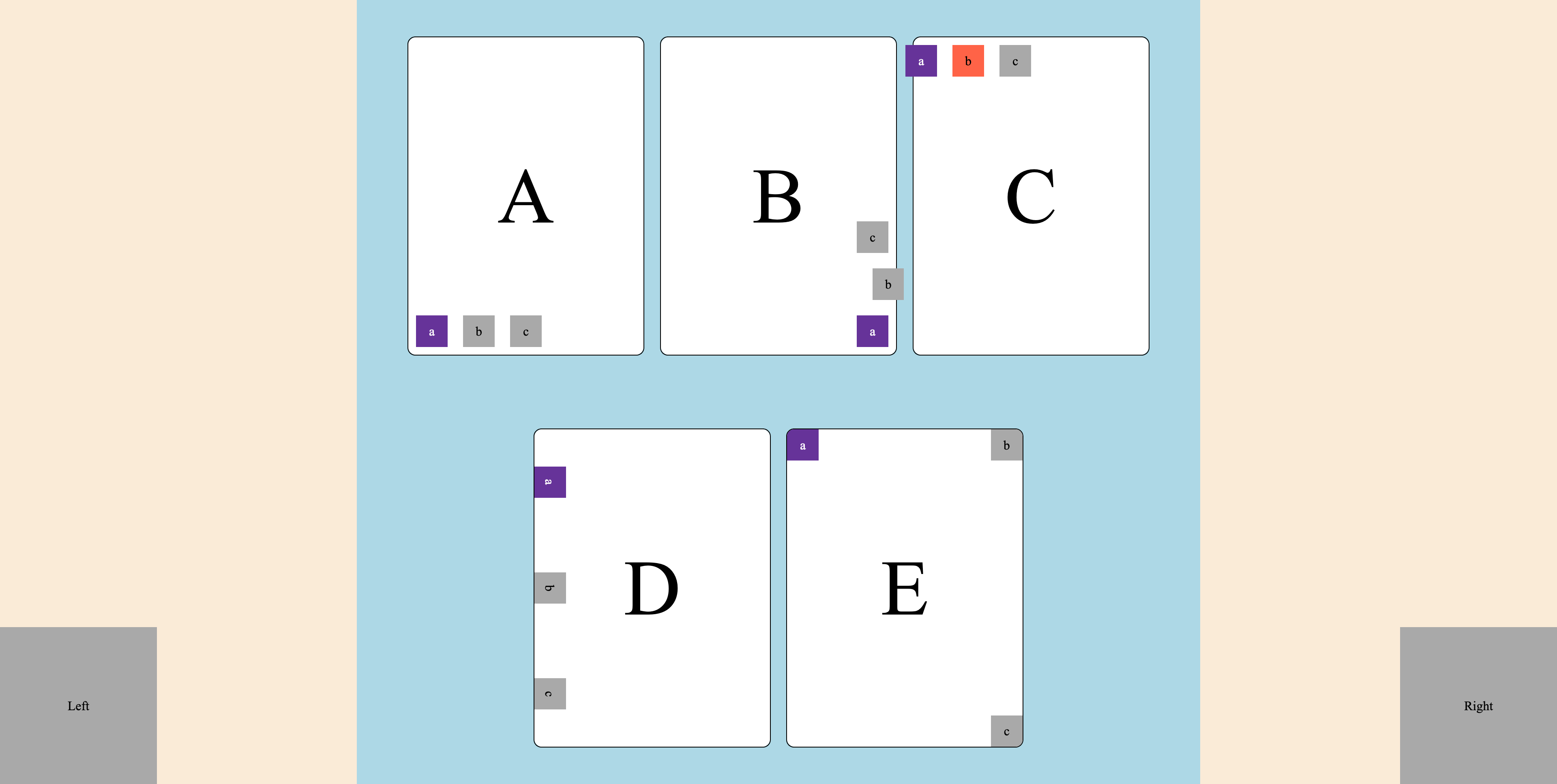](images/lab1_mockup.png)
### Optional task
Write your CSS so that the sizes of the elements respond to changes in size of the browser window; the squares should remain squares and the "cards" should retain their proportions.
### Design issues to be aware of
A mockup image does not capture the non-static nature of web pages such as:
- browser window size
- how the layout is affected by different aspect ratios between width and height
of the users' web browser
- It is OK if the number of cards on the rows change depending on the browser size, but it should be possible to achieve the same card layout as in the mockup image.
**Do not spend to much time on the following**:
- the exact color of the elements
- the exact type-face of the text
- trying to match the exact pixel size of elements in the mockup image
### Implementation requirements
Try to write your CSS so that it is modular, allowing you to combine classes.
There are different approaches as to how to do this and you may find some
inspiration from this article: [How to implement Basic Modular CSS][modularcss].
You do not however, need to follow any particular standard or approach.
[modularcss]: https://hackernoon.com/how-to-implement-basic-modular-css-guidelines-7r1632l2
### Tips
**CSS has two box models**. [The standard box model][standardbox] and [the
alternative box model][alternativebox]. The gist is that the standard box model
adds the border and padding size to the final width and height of the element.
This means that if you use padding or borders, the element will take up more
space than was specified by its width and height.
Using the alternative box model, the border and padding "eats" from the content
box, which means that the element will actually be the width and height
specified for its content box.
Here is one way of enabeling the alternative box model for all your css:
[Inheriting box-sizing probably slightly better best-practice][alternativecss]
[standardbox]: https://developer.mozilla.org/en-US/docs/Learn/CSS/Building_blocks/The_box_model#the_standard_css_box_model
[alternativebox]: https://developer.mozilla.org/en-US/docs/Learn/CSS/Building_blocks/The_box_model#the_alternative_css_box_model
[alternativecss]: https://css-tricks.com/inheriting-box-sizing-probably-slightly-better-best-practice/
[**CSS Grid Garden**](https://cssgridgarden.com/) is a game where learn grid
layout by solving puzzles where you grow a carrot garden using grid property rules.
[**Flexbox Froggy**](https://flexboxfroggy.com/) is a game where learn flexbox
layout by solving puzzles where you move a frog by writing flexbox property rules.
Page responsible: Robin Keskisärkkä
Last updated: 2026-01-20
